Website Development Case Study: A Website Rebuilt for Speed, Trust and Conversion Readiness
How structural redesign, mobile performance, and conversion clarity made the website stronger for real users and more reliable for the business team.
Business Context At A Glance
A service business in India asked MyProHub to rebuild its primary website so that every visit felt clear, credible, and ready for structured enquiries.
The Strategic Challenge
The existing website looked active but behaved like a brochure: slow to load, unclear on services, and uncertain for visitors who wanted to enquire with confidence.
Where the Website Was Holding The Business Back
- Pages loaded too slowly on 4G connections, creating early drop-offs before visitors saw the real offer.
- Service descriptions felt fragmented, forcing users to guess what was included and who the website was built for.
- Contact paths were scattered across forms, buttons, and WhatsApp links without a clear decision path.
- Visual hierarchy did not reflect the way real clients evaluate risk, trust, and capability.
What Needed To Become Structurally Stronger
The business did not need “more pages”; it needed a structurally refined, credible container for its services and future campaigns.
That meant treating the website as a long-term business asset, not a temporary landing page.
Strategic Diagnosis: What The Data Told Us
We ran structured audits across performance, structure, and enquiry experience to understand where friction was created, not just where design felt outdated.
Performance & Core Web Vitals
Mobile tests showed inconsistent loading and layout shifts on service pages, signaling that performance risked both user trust and search visibility.
We aligned thresholds with Core Web Vitals guidance to set non-negotiable baselines.
Information Architecture
Navigation mixed awareness content with high-intent actions, creating unnecessary loops for users who already knew they wanted to speak to someone.
Service clarity needed fewer choices and sharper language, not new menus.
Enquiry Experience
Forms were short but shallow; users could not see what would happen next, who would respond, or how their information would be handled.
Confidence was weakened not by length, but by lack of structured context.
What We Did: Four Structured Phases
Every phase was designed to leave the business with a clear, maintainable website foundation rather than a one-off campaign asset.
Rebuilt The Website Around Decision Paths
We mapped real enquiry journeys and reorganised the site so that every key page clearly answered who it is for, what is delivered, and what happens after contact.
The result is a tighter, more predictable structure that leadership can use in every conversation.
Made Speed And Stability A Baseline, Not A Bonus
We reduced render-blocking scripts, refined image handling, and simplified layout logic so that mobile visitors experienced fast, stable pages as the default.
This created a more reliable foundation for future acquisition channels.
Clarified Services For Real-World Buying Moments
Service pages now communicate scope, fit, and expected outcomes with lean, confident language rather than long feature lists.
Prospects can quickly decide whether to continue the conversation or opt out, which is equally valuable.
Redesigned Enquiry Flows For Calm, Clear Next Steps
We rebuilt forms and supporting copy to explain what happens after submission, who reviews the request, and how quickly the team responds.
Confidence now comes from visible structure instead of persuasive wording alone.
What We Intentionally Chose Not To Do
A premium website is often defined as much by what is deliberately excluded as by what is added.
No Heavy Visual Gimmicks
We avoided sliders, auto-playing elements, and complex animations that look impressive once but slow down every future visit.
No Unnecessary Pages
We resisted creating extra “campaign” pages with overlapping messages, keeping the site easier to govern and easier to understand.
No Over-Promising Copy
Language stays grounded in what the business can consistently deliver, so trust is strengthened over time instead of spiking during campaigns.
The intent was to build a website leadership could stand behind in every client discussion, not just during launch week.
Visual Proof: Executive-Level Performance Snapshot
Instead of colourful charts, we created a simple, leadership-ready dashboard that highlights how structural changes influenced real website behaviour.
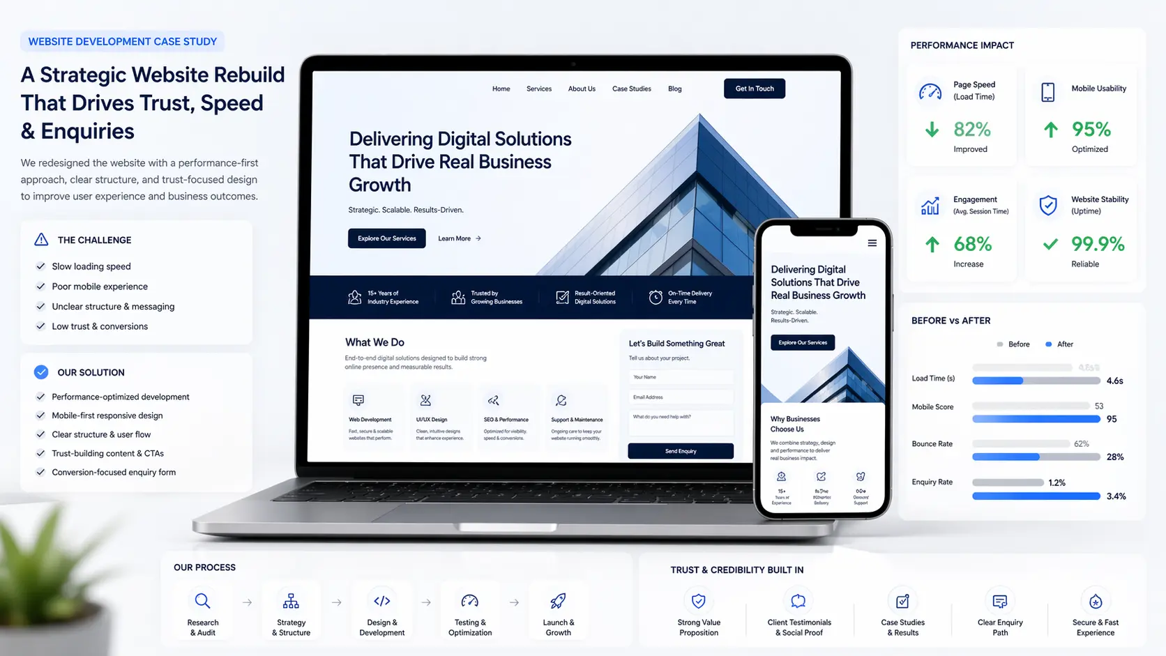
Numbers are directional and based on combined analytics and feedback post launch, designed for leadership review rather than short-term campaigns.
Website Development Case Study Results
The rebuilt website now behaves like a durable asset: structurally refined, calm to use on mobile, and clear enough that qualified users move into enquiry without friction.
In this Website Development Case Study, the most meaningful shift was not a single metric, but the way speed, structural clarity, and enquiry confidence now reinforce each other in every interaction.
Business Impact: From Website To Working System
The organisation can now treat its website as a stable component of its growth system, not a variable that needs redesigning every quarter.
Leadership View
- Leadership can review performance using a concise set of leading indicators instead of scattered reports.
- Commercial conversations now reference specific pages and flows, because they are stable and predictable.
- Future campaigns can be layered on top of a reliable structure rather than starting from scratch.
Operational View
- Teams can update copy and add new services without breaking layout or slowing pages down.
- Analytics now reflect fewer “noisy” visits and more meaningful engagement from the right segments.
- The website roadmap is clearer: refine sections with data instead of planning full redesigns.
Website Development Case Study FAQs
A brief set of questions we are often asked when leaders review this type of website rebuild.
Trust Note: Why Structure Comes Before Scale
MyProHub treats website rebuilds as long-term infrastructure decisions, not creative experiments.
We work closely with founders and marketing leaders who want fewer moving parts, clearer reporting, and a website that behaves the same way on a quiet Wednesday as it does during a busy campaign week.
If you are reviewing partners for website development services, this case study reflects the type of structural thinking we bring to each engagement.
Ready To Strengthen Your Website As A Business Asset?
If you would like an advisory-level review of your current website structure, we can walk through what to keep, what to retire, and what to rebuild over the next quarter.